Populous Brand Refesh
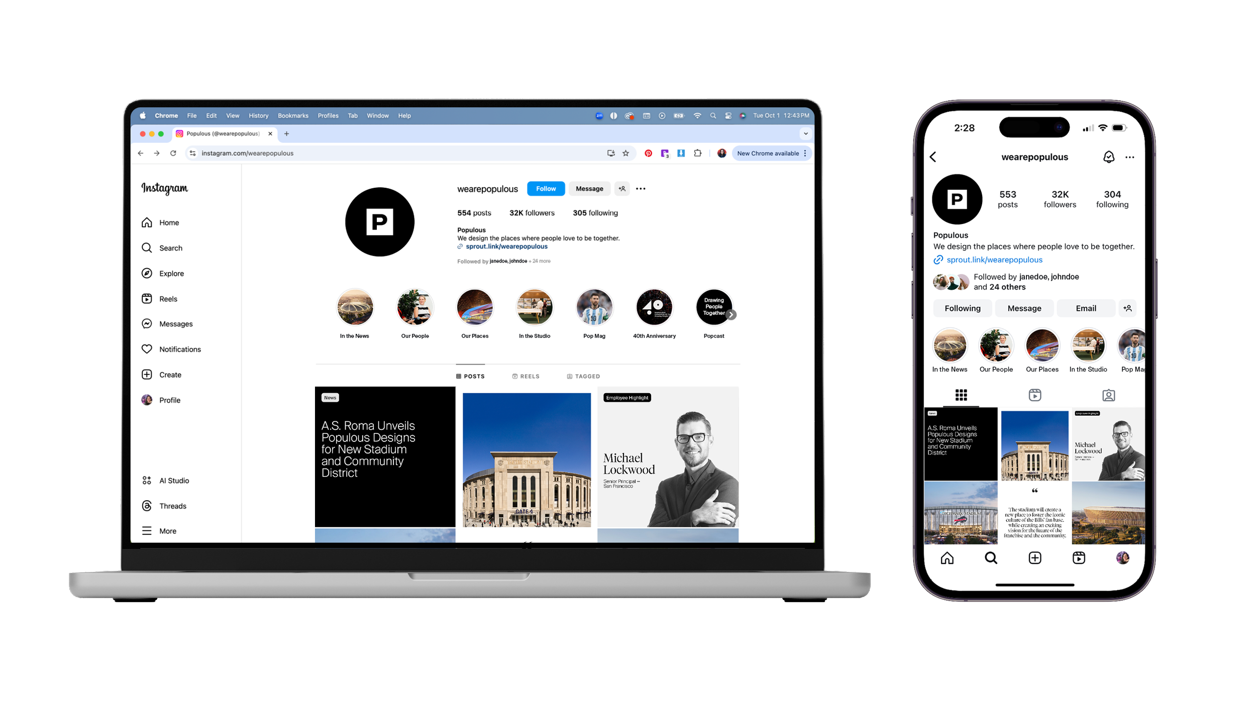
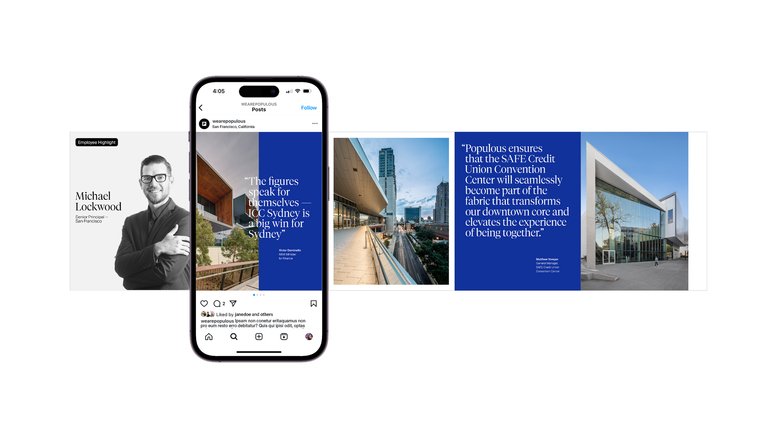
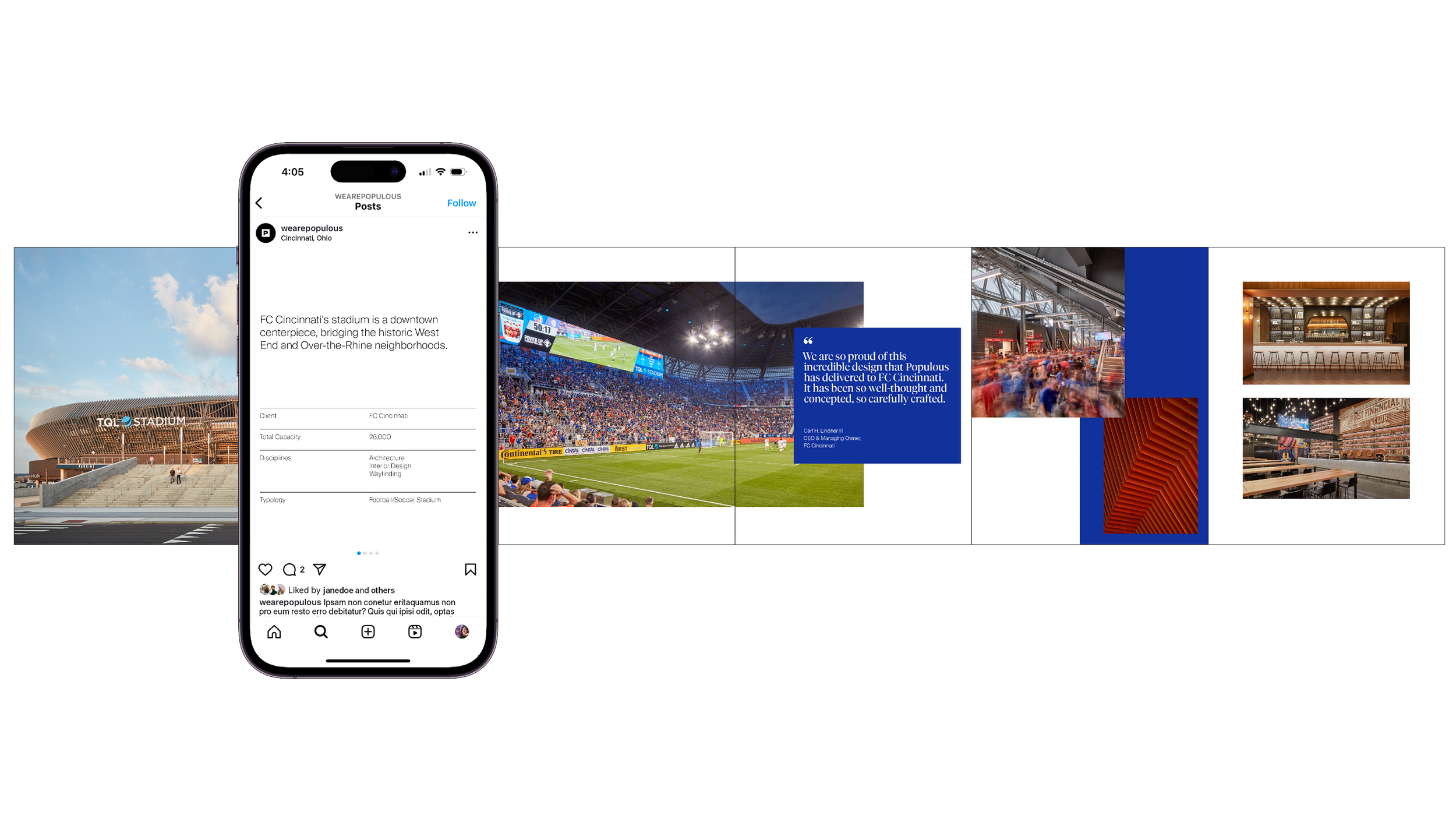
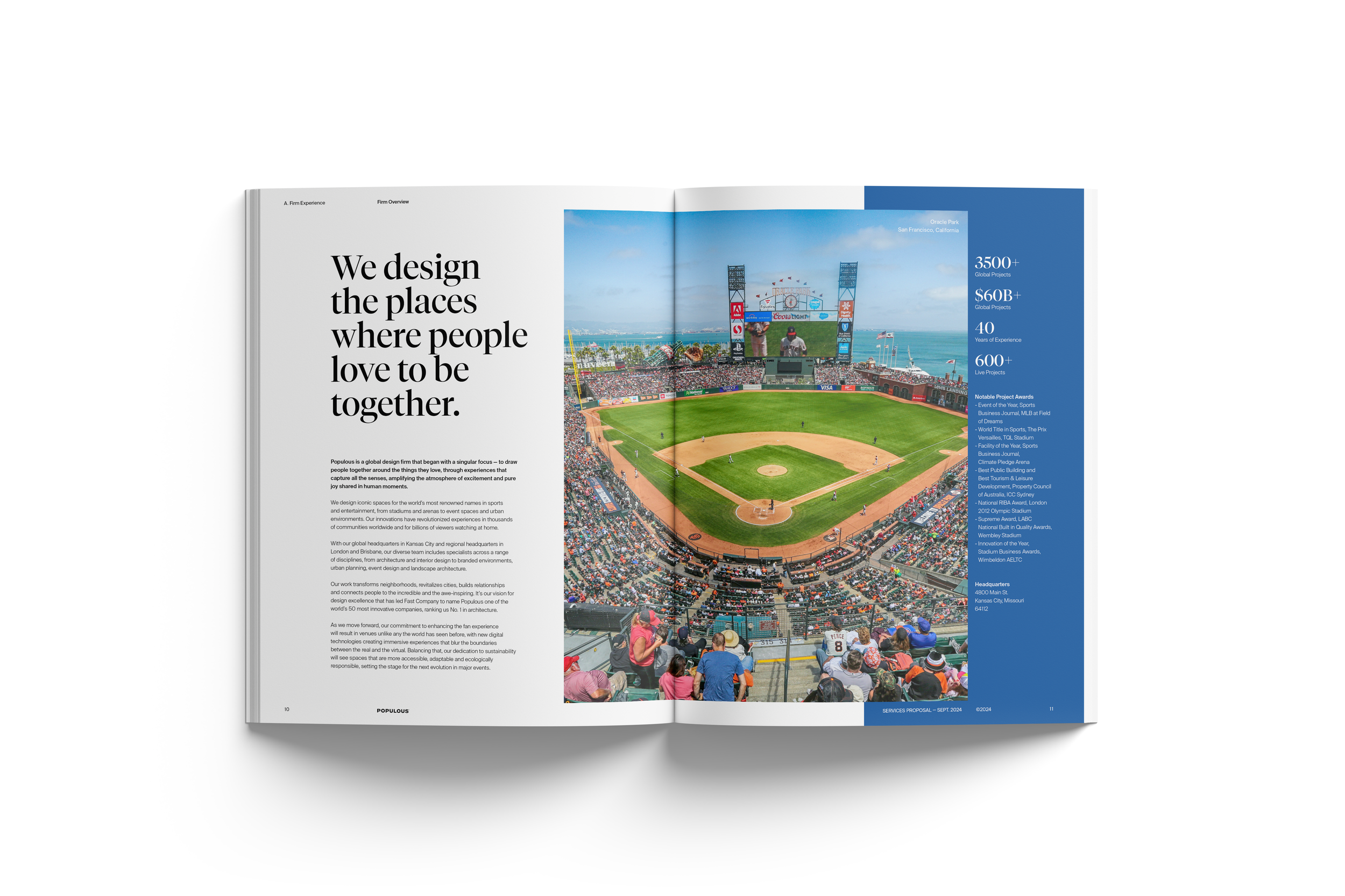
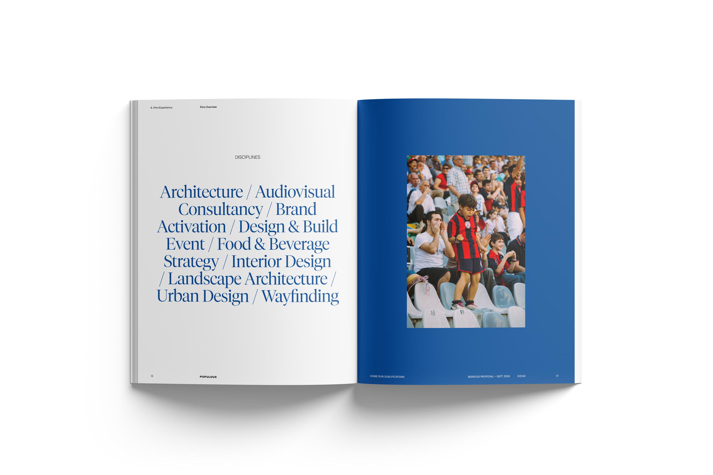
After five years of the previous brand guide, Populous needed an update along with its marketing materials. It was feeling outdated and not in tune with the current design landscape. Our creative director and team came up with a new brand guide with a more modern typeface and shade of Populous Blue. It’s inspired by and reflective of Suisse design and current trends. This refresh cements Populous’ place in the space by showing clean, innovative design not only in their architecture, but by how they present themselves.
The marketing materials were updated to match the current brand guide in a short timeline. as a group, we met weekly to critique our designs to make sure they were all in alignment.
My role was senior graphic designer tasked with leading design of business proposals and everything they contain, social media, and business cards. I worked with the creative director (Americas), marketing design manager, and fellow designers on my team.
The target audience is internal (employees, office design, etc.) and external (potential clients, connections, social media audience, etc.)
Disclaimer: The information used is public information provided by Populous’ website or social media, lorem ipsum, stock image sites, or simply spec wprl. Most work was done while working at Populous.
Client
Populous
Project Type
Branding, Layout, Typography, Social Media, Print, Art Direction
Year
2024
Typography
Primary
Secondary
Color Palette
Pop Blue
Secondary
Secondary
Tertiary
Tertiary
Inspiration
Business Cards
Sample Request for Qualifications / Proposal
Inside Cover
Cover Letter
Table of Contents
Section Breakdown
Company Overview
Company Services
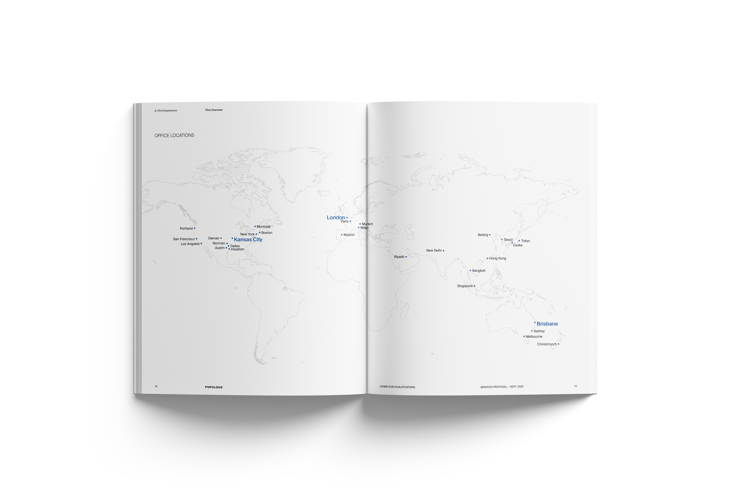
Office Map
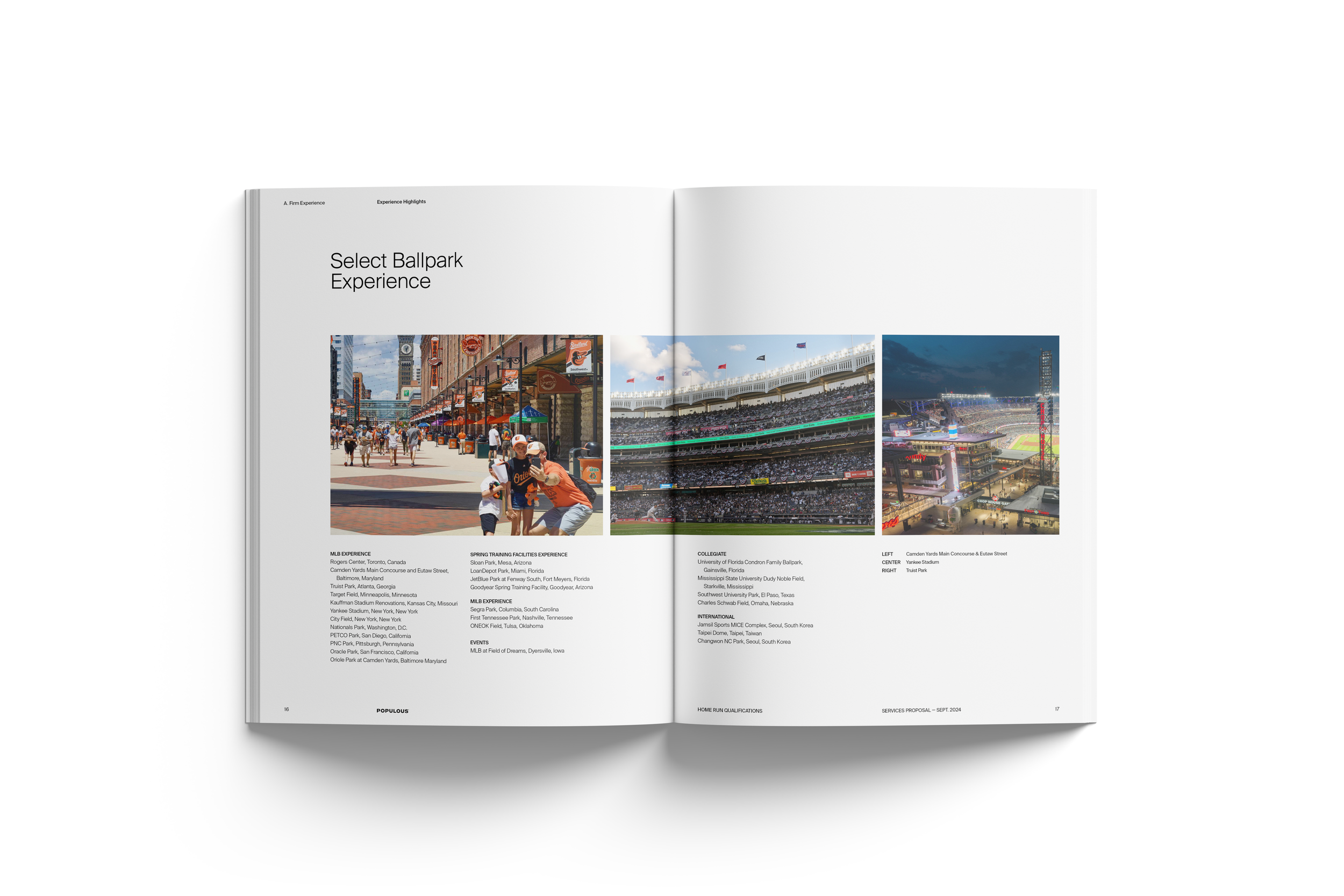
Select Experience Longform
Subsection Divider
Relevant Experience Project
Relevant Experience Project
Relevant Experience Project
Relevant Experience Project
Relevant Experience Project
Section Breakdown
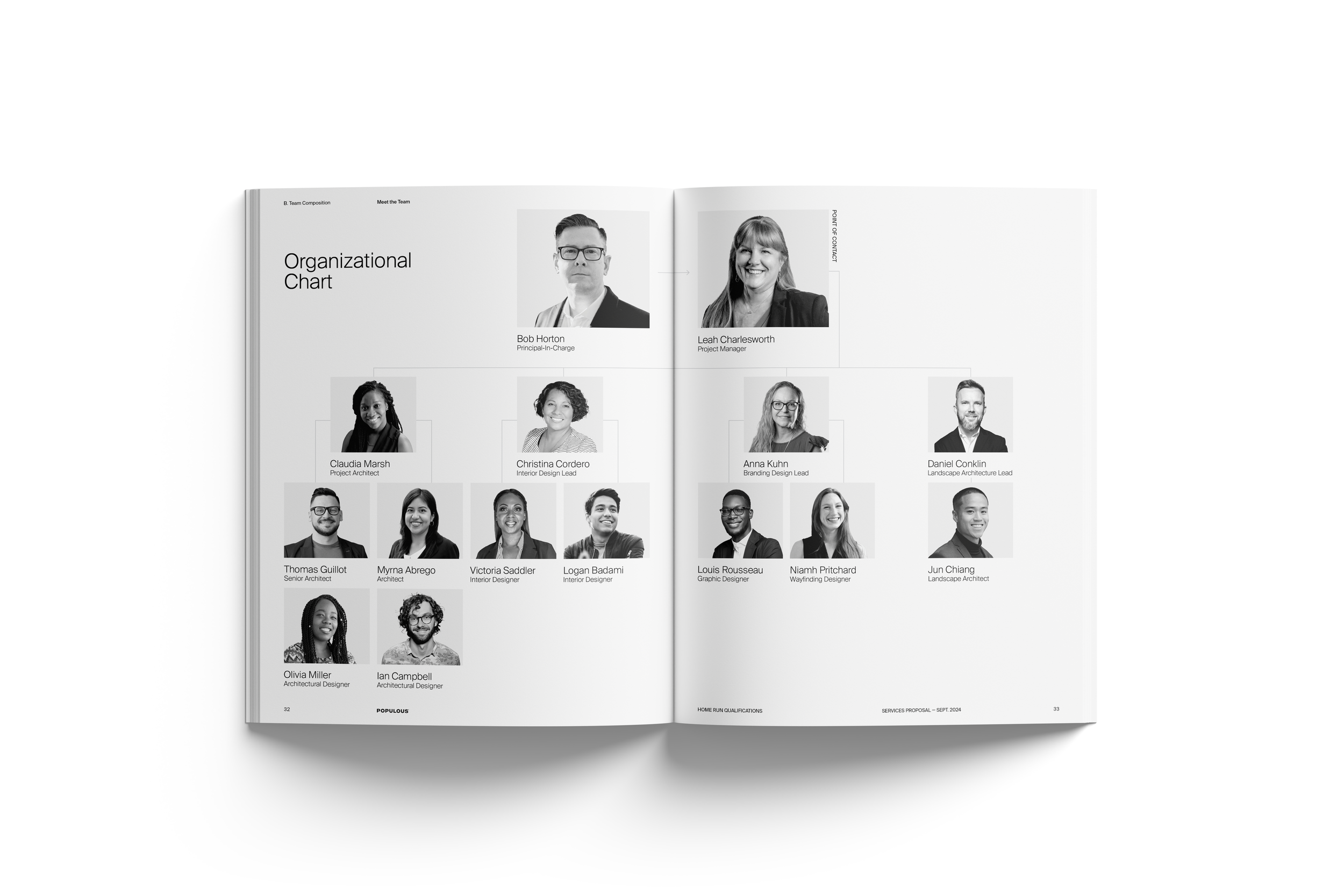
Organizational Chart
Resume Full-Spread
Resume Half & Quarter Spread
Social Media
